


Pablo Picasso said, “Colors, like features, follow the changes of the emotions.” This is well-known among artists, designers, advertisers and even psychologists. Certain colors trigger predictable emotional responses and have even been linked to changes in blood pressure, appetite and eye strain.
Color is powerful—it plays a major role in how centered you feel. Whether you’re completely redesigning your home or just feel like adding some new décor, keep the following in mind when selecting colors.

Red is the color of high energy. It’s a show-off. It demands attention. It has been shown to raise blood pressure and is associated with danger. But when used judiciously, it can stimulate human interaction and conversation. It’s not a good choice for bedrooms, but can be used in public spaces designed for entertainment

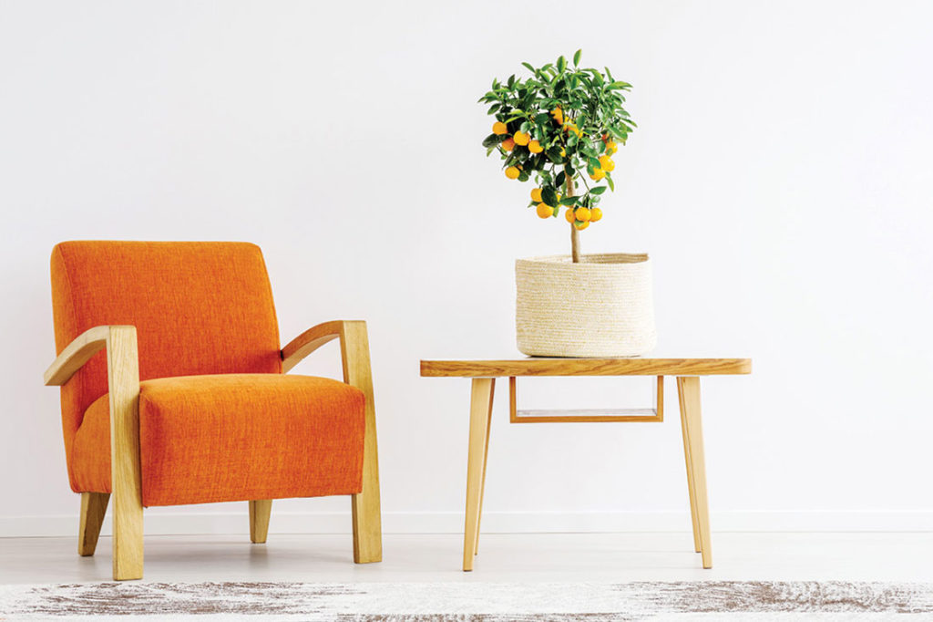
Orange is a stimulating color that compels you to action but without the intensity and danger red provokes. For this reason, orange is easier to work with in the home, especially if you choose autumnal hues. It’s a good color in playrooms and exercise areas.

This is the color of sunshine and happiness. It’s a good choice for rooms you occupy in the morning such as the bathroom, breakfast nook and foyer. Although it’s cheery, it should be used with care, as too much yellow can induce feelings of frustration and anger.

A supremely restful color, green is considered to be easiest on the eye. Because it’s found everywhere in nature, it’s the ideal color for a well-centered home. It creates a sense of relaxation, peace and warmth.

Blue is calming. The soothing color of the ocean and sky has been demonstrated to reduce blood pressure and slow the heart rate, making it a beneficial color for bedrooms and bathrooms. Richer tones—think teal or periwinkle—are good for family rooms and open kitchens.

In its lighter shades of lilac and lavender, purple is another restful color. Many years of cultural associations mean people tend to regard it as distinctly feminine, meaning it’s not the best choice for a couple’s bedroom. Consider using it with a light touch in the bathroom for a spa-like feel.
—Adapted from The Well-Centered Home by William Hirsch
This article originally appeared in the November/December 2020 issue of SUCCESS magazine.
Photo by Photographee.eu/Shutterstock.com
[fl_builder_insert_layout slug=”amazon-affiliate-disclaimer”]